eLocal Business Listing Form
Design / Code
Project Details
Type: Web
For: eLocal
A business listing service
Date: 15 March 2015
About the Project
eLocal had a long and complicated submission form for businesses who wanted to add themselves to our online directory. I wanted to improve conversions on this form while also updating the look and feel to match the style guide I had just made. I streamlined the form and changed the user flow, which pointed to very promising results in my CRO (conversion rate optimization) tests.
The Tests
For the first test, users followed two different flows on paper prototypes. One group completed Steps 1-4 before their listing was created, and the other group completed Steps 1-3, with an option to go onto step 4 after their listing was created.
Step 4 contained all the additional info that rounded out the business listing but wasn't strictly necessary to get started. It was also by far the longest and most complicated step.
Step 4 Wireframe
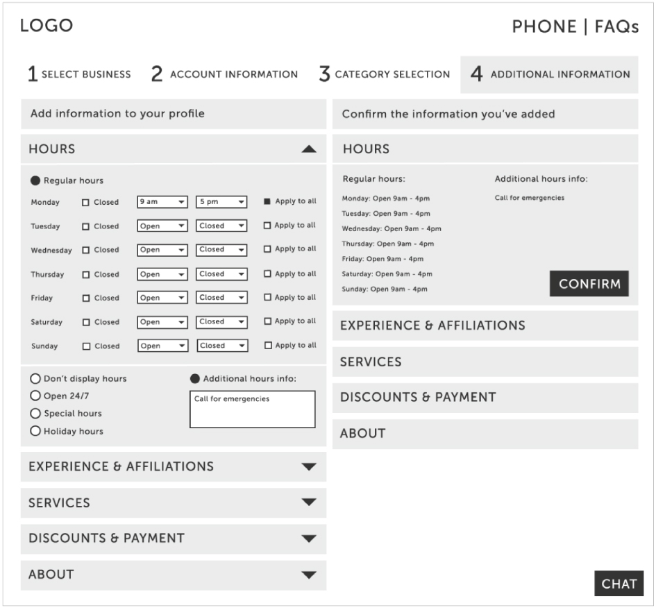
From that test, I learned that many users lost interest in completing the form due to how long and complicated Step 4 was. But when Step 4 was broken out from the main form, users were more likely to complete the signup process.
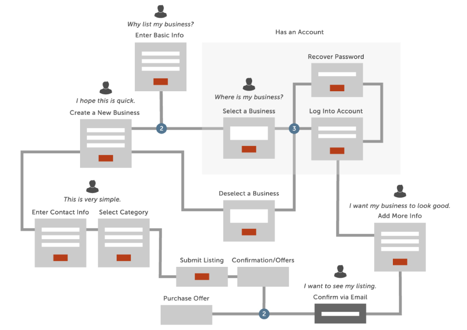
After discussing these results with my test users, I understood why. When users saw how sparse their listing looked after completing Steps 1-3, they saw the value in adding all the information in Step 4. I made a user flow to help illustrate this breakthrough to stakeholders:
Armed with this information, I streamlined the form design by removing extraneous fields and arranging the inputs into collapsing sections on the same page, rather than splitting them up between pages (to decrease the page loading time).
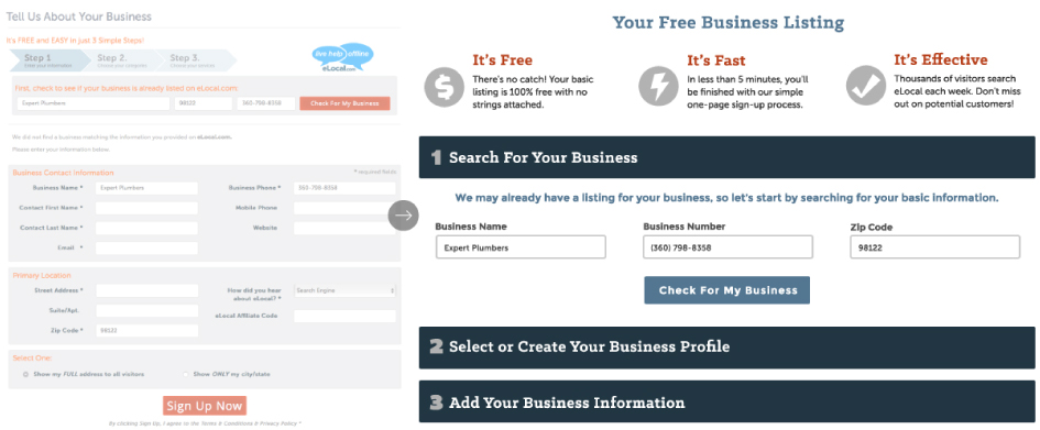
The Old Form
The New Form
I A/B tested an alternate layout with rearranged information and a slightly different look, but discarded it in favor of having the "free, fast, effective" description visible at the top on every step. The winning layout encouraged 4% more users to complete the form.
The Alternate Layout
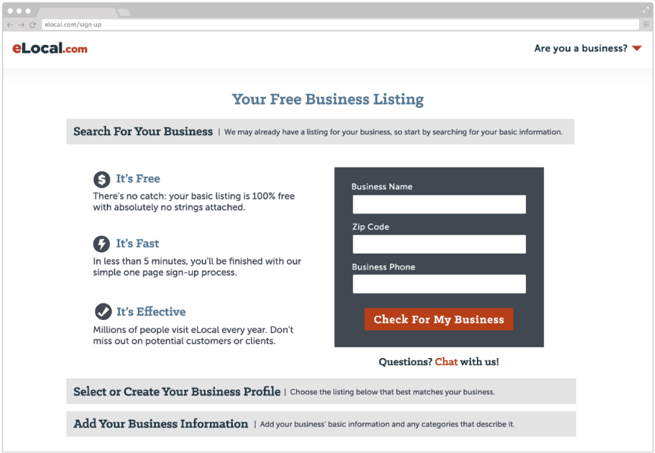
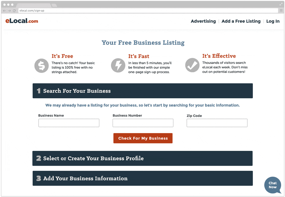
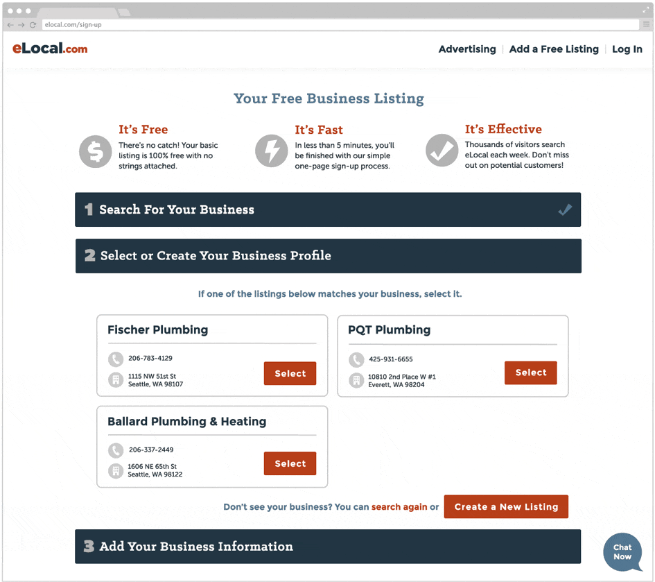
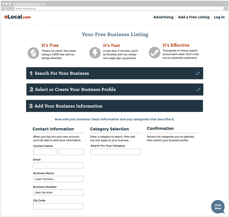
The Registration Process
After the user completes Step 1 (seen above), Step 2 opens in an accordion:
For Step 3 I designed a keyword search feature to simplify the previously tedious and confusing process of adding tags to the business listing.
In an A/B test against the old submission form, the new design led to a 22% drop in abandonment rates, and 18% more fields from Step 4 being filled out per business listing.