barre3 Rebrand
Website / Style Guide
Project Details
For: barre3
A fitness brand
Role: Product Design, Art Direction
Date: 1 January 2016
About the Project
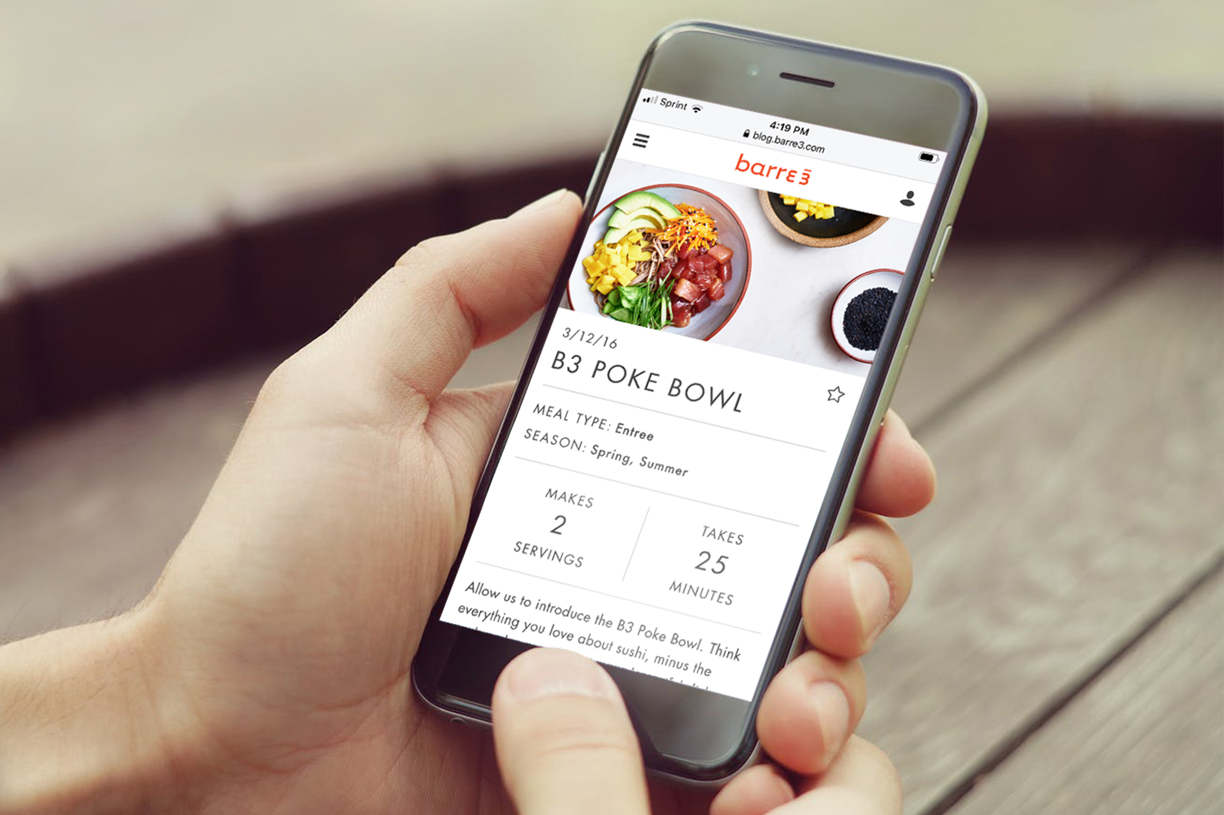
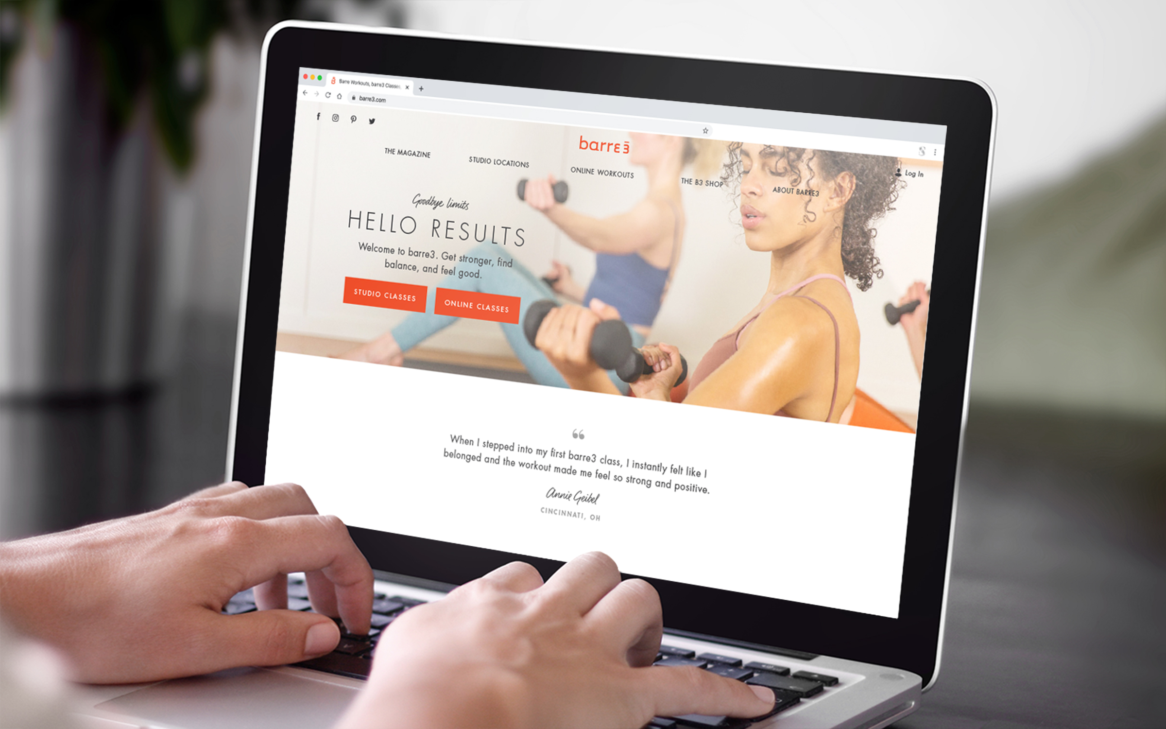
Barre3 hired me to guide the design direction of their new website. They needed a custom platform to support their business, which includes hundreds of studio locations, an online workouts subscription service, a blog, and a shop. I was deeply involved in every step of the year-long process, from the holistic vision to minute details of the execution. I also translated my work into a style guide that set the tone for the rest of the company’s print, retail, and social media design efforts.
The Research
I dove into UX research with a series of user interviews and surveys. I found that the website’s biggest issue was its cluttered and disorganized layout, which felt off-putting and off-brand, and made it hard to find content.
“Whenever I take a class in one of your studios, I always think how clean and modern they are. The website doesn’t really match how the studios feel.”
Studio Client
The Planning
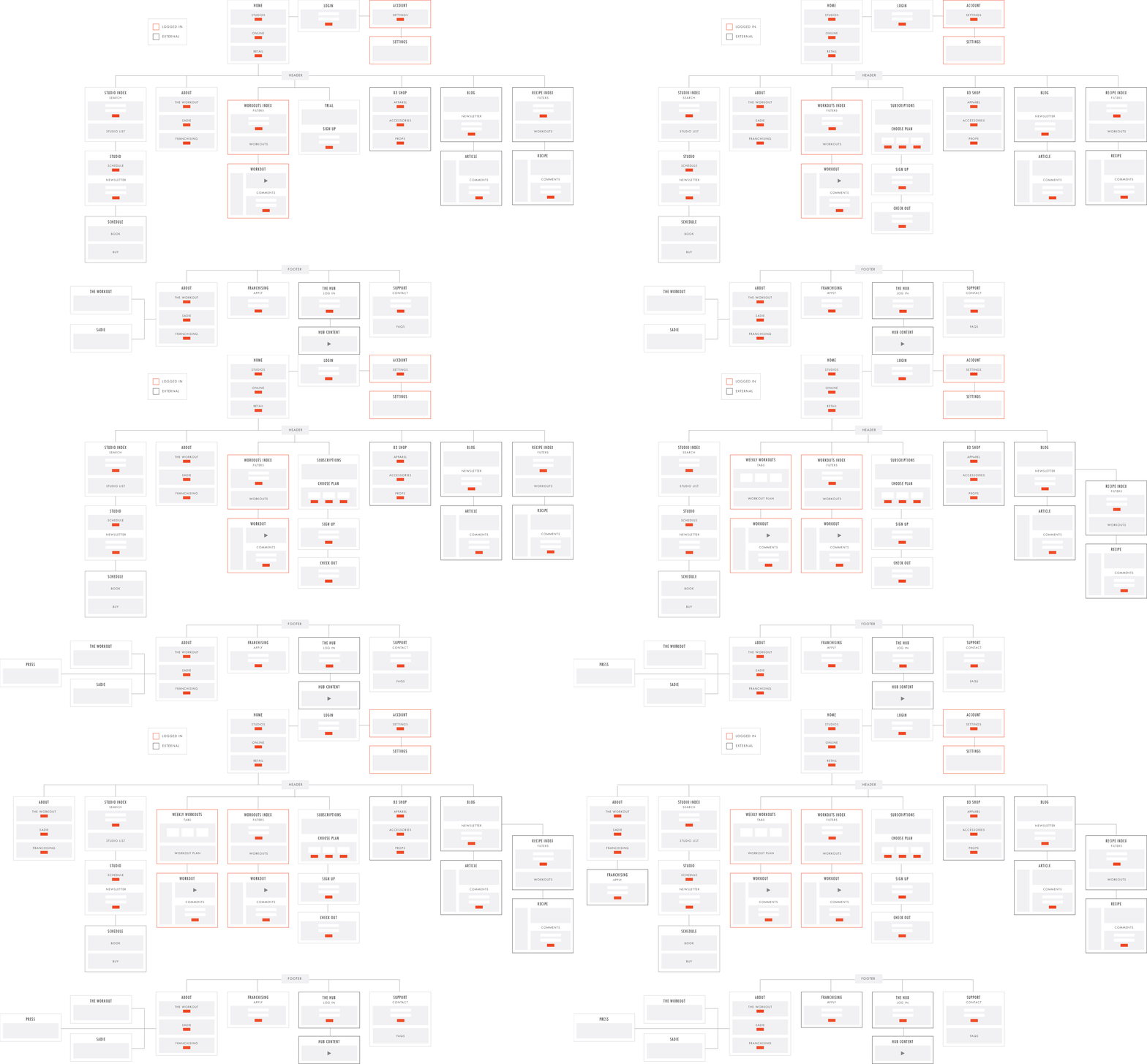
After building out a site map, I altered it to optimize user flows and better support our business goals.
Sitemap Evolution
The Design System
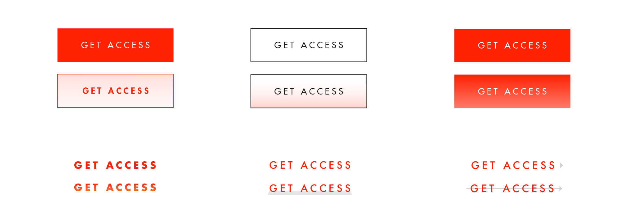
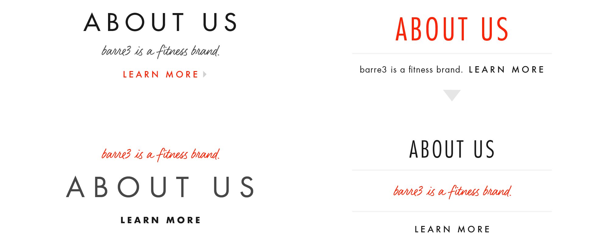
Almost every part of the barre3 brand was up for reevaluation, except for the logo and orange brand color. I tested various typefaces, additional colors, and visual treatments to find a style that felt fresh but wasn’t too radical of a departure from the old branding.
Button and Link Exploration
I decided to use bold, clean Futura for the primary typeface, and brought in a handwritten accent font to express the warm, personal touch that is such an important part of the barre3 brand.
Visual Treatments Exploration
The Launch
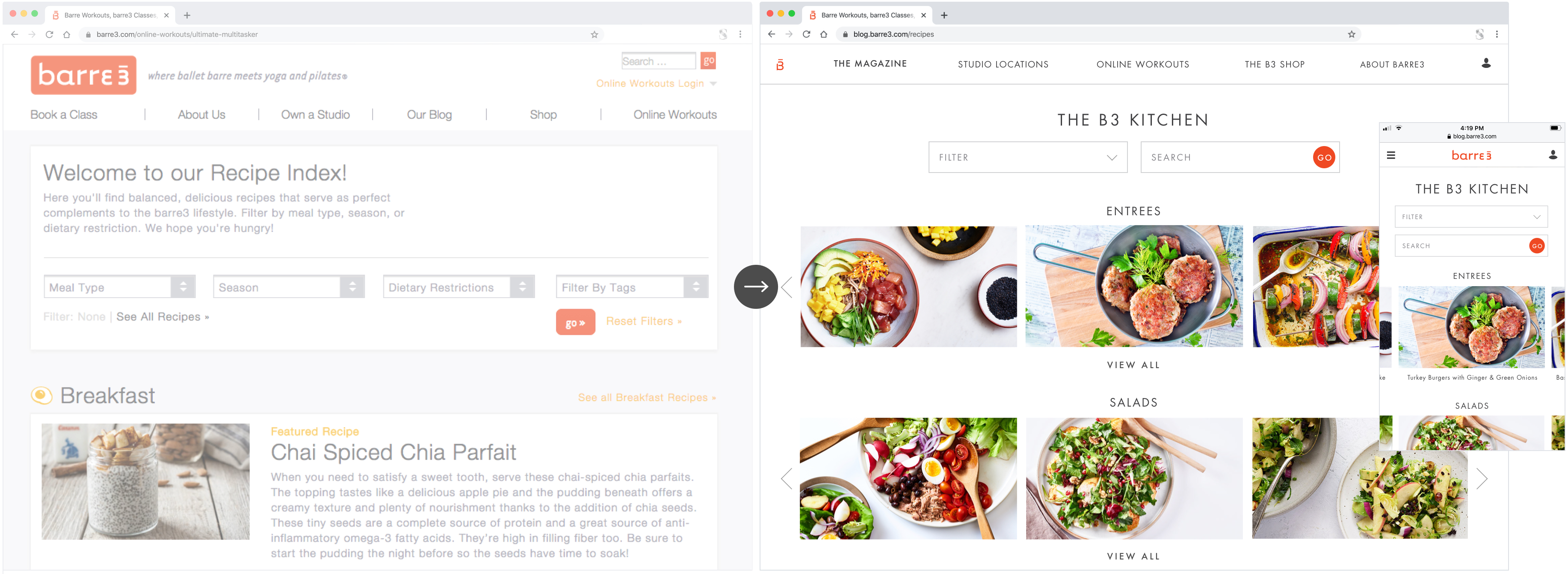
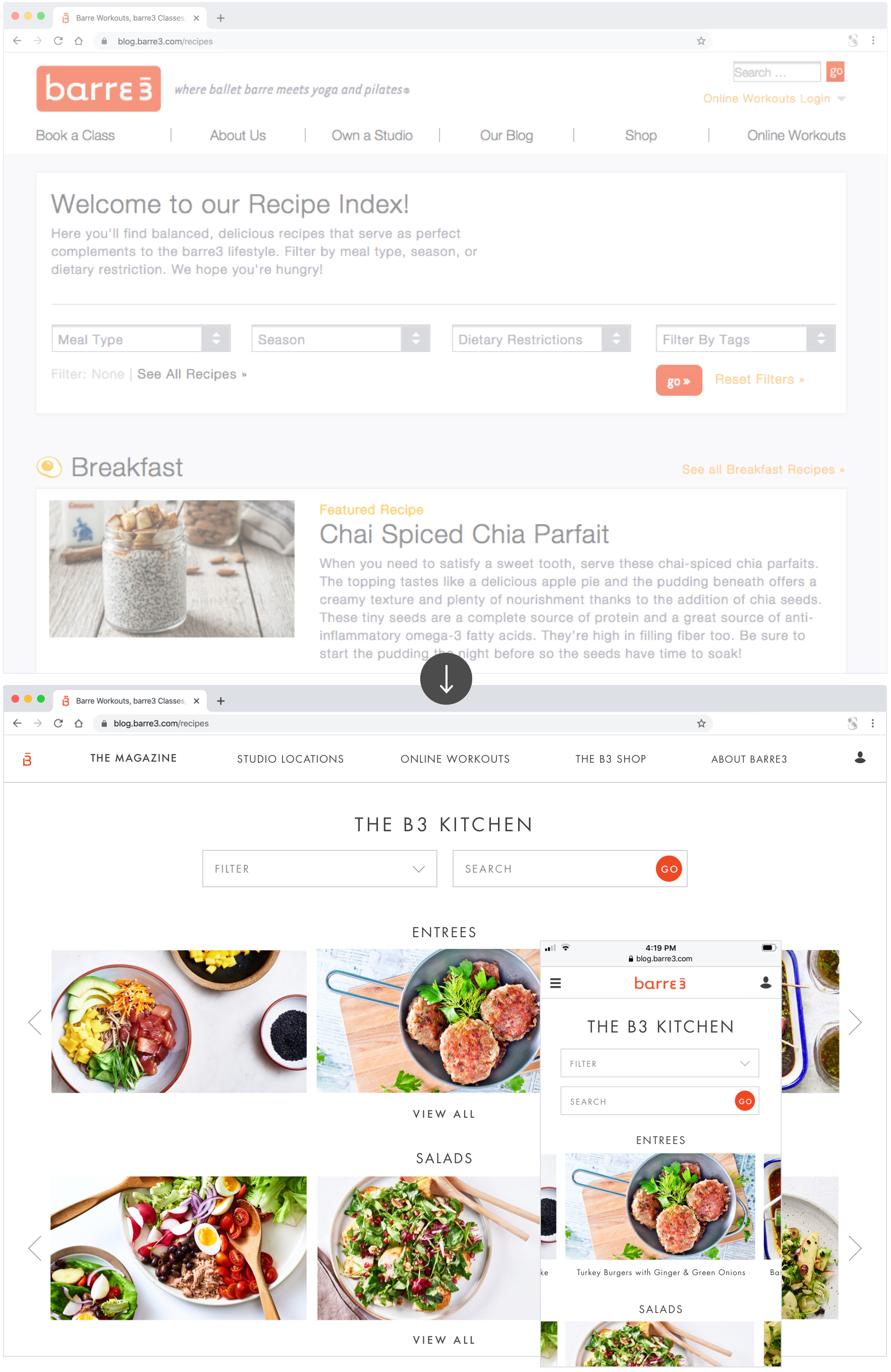
Index pages were converted from unwieldy lists into visually-driven rows of categorized carousels. Drop-down menus offered more filtering options (a feature that many users requested in my initial interviews).
Old Recipe Index
New Recipe Index
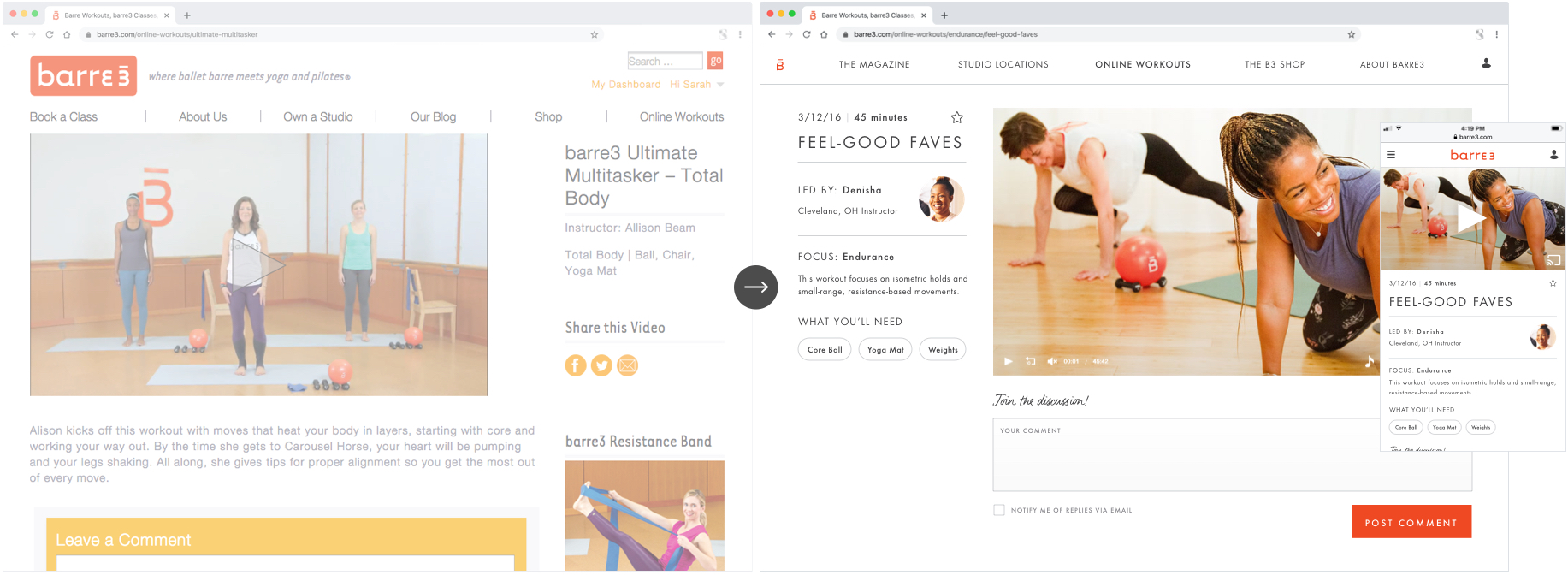
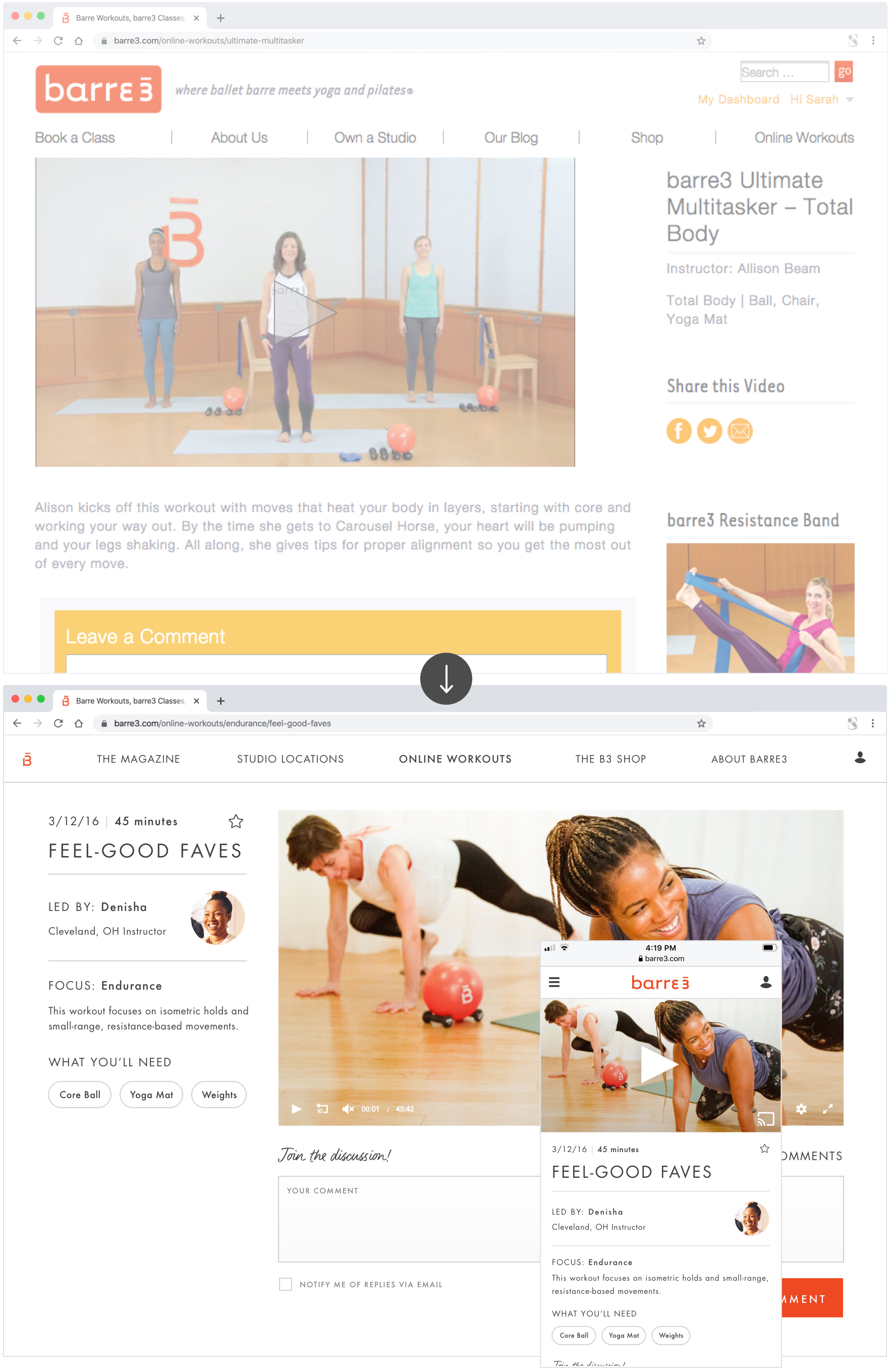
I systematized layouts with a left sidebar element and reorganized content for maximum clarity.
Old Online Workout
New Online Workout
The Style Guide
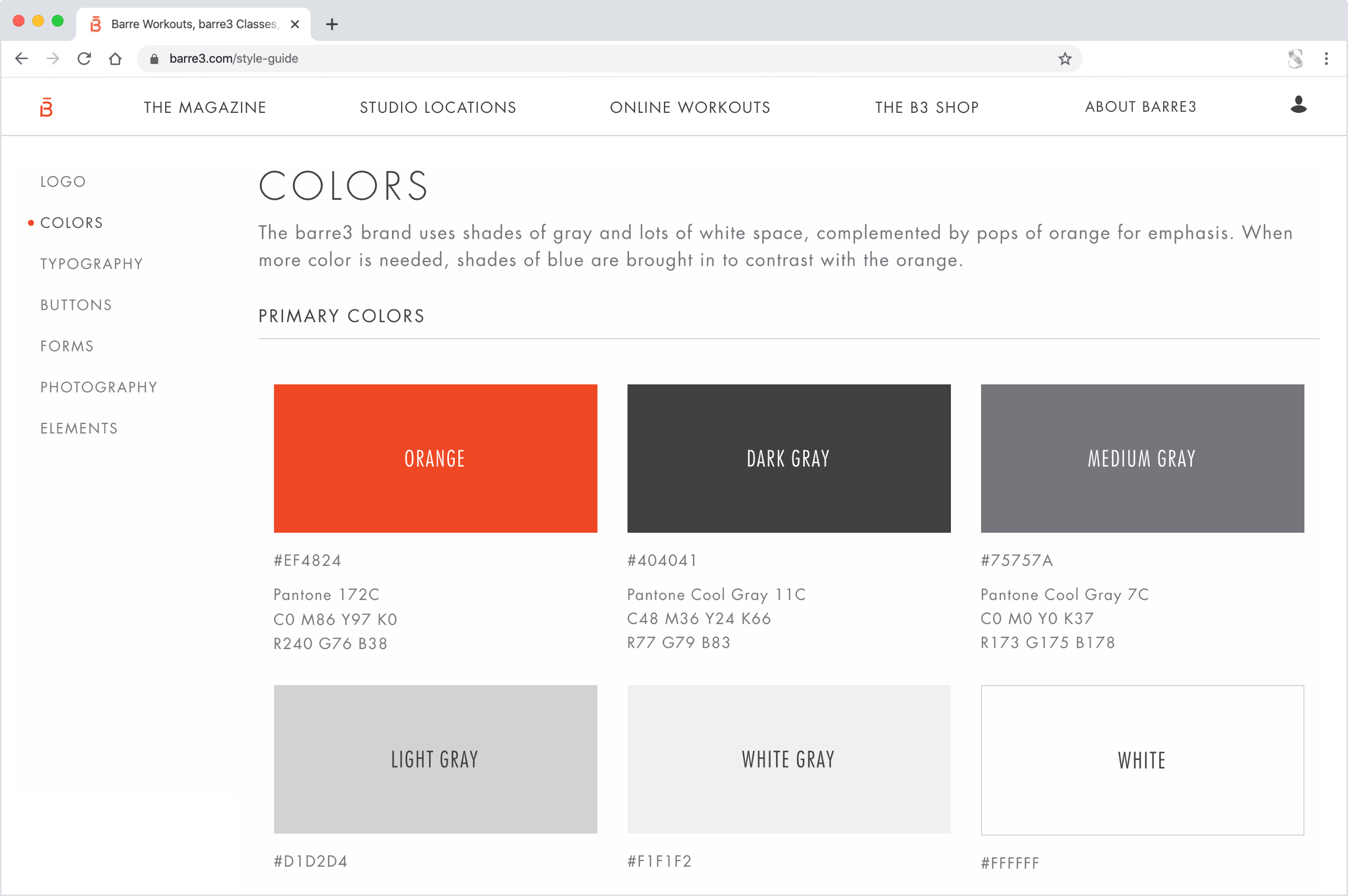
When the design was complete, I created a living style guide as a resource for barre3’s collaborators, developers, and other designers. The new guide not only informed branding decisions but also provided a system of naming conventions for our developers to use.
The Feedback
After the site launched, another round of user interviews confirmed that it was now much easier for users to find content. There was also a flurry of unsolicited feedback from users who loved the new look:
“I’m obsessed with your new website! It’s so user-friendly, clean, and PRETTY!”
Online Subscriber
